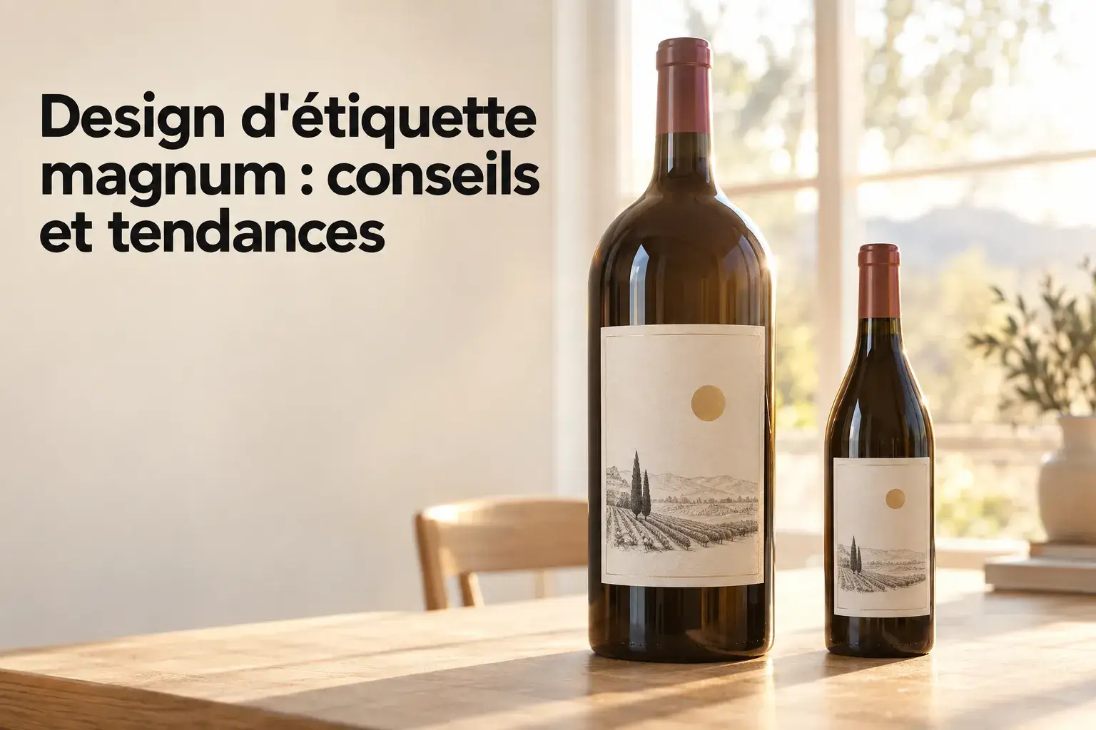
Magnum Label Design: Tips and Trends
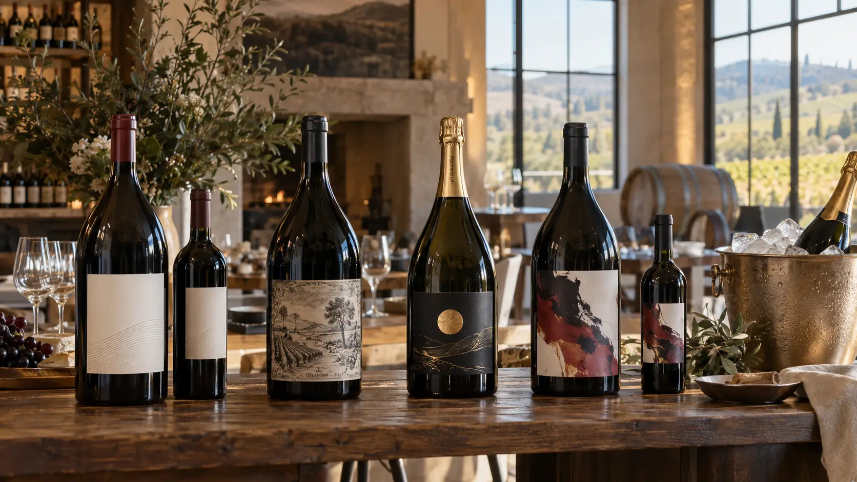
Designing a label for a magnum requires some specific guidance on three key points: dimensions, materials and regulations. You need to adapt the scale to the 1.5 L bottle, include the mandatory information, choose a material that withstands an ice bucket and follow graphic trends without sacrificing readability.
Size and format of a magnum label
A magnum is not treated like an enlarged 75 cl bottle. Its surface area, curvature and use change the balance of the label. Designing labels for this bottle therefore starts with real measurements before any graphic choices are made.
Measure the labelling area
A magnum holds 1.5 L: twice the volume of a standard 75 cl bottle. There is no single regulated size for its label. The template depends on the bottle itself: its available cylindrical area and its curvature.
Models vary from one glassmaker to another. One Bordeaux magnum is 343.5 mm high with a diameter of 98.1 mm. Another is 346 mm high with a diameter of 98 mm, while a third is 350.7 mm high with a maximum diameter of 101.7 mm. In practice, measure the exact bottle you will be filling, not a generic reference.
Compare available formats
Once the diameter has been measured, the circumference gives an idea of the surface area. For a 98.1 mm body, it is approximately 308.2 mm. This geometric calculation helps position the label; it does not determine its dimensions.
Common 75 cl formats serve as a reference point. For sparkling wines, a champagne label on a magnum often measures around 100 × 135 mm, with no standard size.
| Format | Dimensions | Usage |
| Small format | 60 × 80 mm | Half bottles or minimalist designs |
| Standard vertical | 90 × 120 mm | Most common on 75 cl |
| Magnum champagne label | Approximately 100 × 135 mm | Common reference, non-normative |
| Large format | 100 × 150 mm | Premium wines |
A label designed for a Bordeaux bottle with a diameter of approximately 98 mm may not necessarily be suitable for a sparkling wine bottle with a diameter of approximately 114.5 mm. Votre Étiquette therefore offers custom die-cutting, with no limits on sizes or shapes.
Design the sides of the bottle
Three label configurations are commonly used on a 1.5 L bottle: a front label only, a front label with a back label, or a custom-cut wraparound label made from a single piece. The front label displays the visual identity, name, brand and designation. The back label contains the technical and regulatory information. A neck label remains optional, for a vintage or an award.
The magnum format requires enlarging the label without disrupting the balance of the design. A small format gets visually lost. Type that is too fine does as well, especially for the cuvée name and vintage.
Mandatory information on a wine label
The choice of back label takes on its full importance when it comes to legal notices. Their list, size and placement are governed by specific rules. The design remains flexible, provided these notices remain accessible.
Bring together the regulatory information
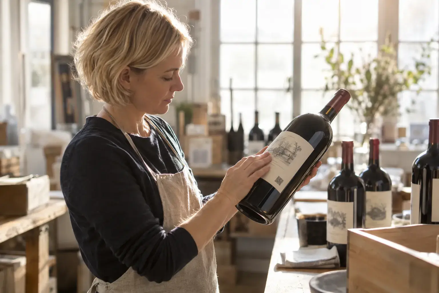
The DGCCRF guide dated December 2025 lists what must appear on a wine bottle label. Key points to prepare from the design stage:
- Product identity : designation (PDO, PGI or generic category), origin and bottler.
- Key figures acquired alcoholic strength by volume (ASV), nominal volume, batch number and sugar content for sparkling wines.
- Consumer information : allergens, list of ingredients, nutrition declaration and health message.
The AOP and IGP specifications may add their own presentation rules. For a Champagne, the word “Champagne” appears on the label and on the cork, along with the sugar category. A single-varietal or vintage Champagne requires 100% of the grapes of the grape variety or vintage indicated. For still wine, the threshold is generally 85%.
Ensure visibility and readability
Mandatory information must be visible and legible, never obscured, truncated or cut off by a graphic. Article 40 of Delegated Regulation (EU) 2019/33 provides in principle a minimum height of 1.2 mm. This height is measured on the actual characters, not according to the font size displayed by your software. The relevant information must also be readable within the same field of vision, without turning the bottle, except for details such as the batch number, importer or certain digital allergen information.
The same requirements apply to the pregnancy health warning, which has been mandatory in France on packaging units since 1 July 2026. It must be legible, easy to understand, permanent, displayed on a contrasting background, and within the same field of vision as the TAVA.
Integrate digital information
Wines produced from 8 December 2023 onwards provide the list of ingredients and the nutrition declaration before purchase. Older batches could be sold without them until stocks were exhausted. A QR code may contain this information, with the full declaration per 100 g or 100 ml. However, the energy value, required allergens and the link must still appear on the physical label.
These texts comply with the minimum size of 1.2 mm, or 0.9 mm if the largest surface area is less than 80 cm². The QR code directs users to regulatory information, not marketing content. The batch number, preceded by “L”, may be added after printing provided it remains indelible. The CRD has no longer been mandatory for volumes up to 3 L since 1 June 2019. Info-tri, however, has applied to household packaging since 1 January 2022.
Premium magnum label production
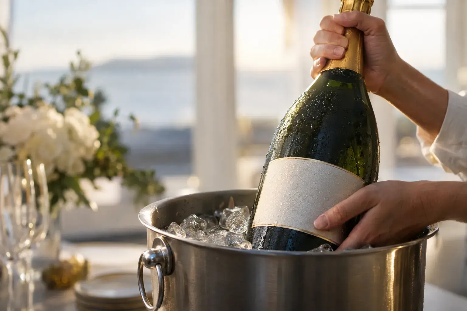
A magnum is often placed in an ice bucket before being served. A premium label must therefore withstand water just as well as it attracts attention on the shelf. The material, adhesive and finishes must be selected together.
Choose a moisture-resistant material
For a magnum chilled in the refrigerator or in an ice bucket, wet-strength paper, treated to resist water, retains its shape and opacity. Standard coated paper, intended to remain dry, does not hold up as well. PP or PET films are suitable when waterproofing, cold resistance or a thin wraparound label are the priority. Votre Étiquette also offers brushed silver, recycled and eco-friendly plant-based papers, with adhesives manufactured in Europe.
Secure adhesion in cold conditions
The backing material is not enough: the adhesive matters just as much. Some moisture-resistant papers, combined with a permanent acrylic adhesive, are tested after at least four hours in ice water. Other tests last two hours and are not considered the standard. Some adhesives designed for cold, condensation-covered glass can be applied at temperatures as low as -20°C.
Before use in an ice bucket, have the complete construction tested: substrate, adhesive, inks, varnish and foil stamping. Watch for lifting edges, slipping, wrinkles, blisters and delamination. Loss of whiteness, degraded inks and loss of adhesion also indicate a poorly chosen construction.
Enhance with finishing touches
Once adhesion is ensured, finishing touches give premium wine packaging its visual impact. Common techniques include hot foil stamping, matte or soft-touch lamination, blind embossing, spot UV varnish, special inks, and custom die-cutting.
Hot foil stamping transfers foil using heat and a die. It creates gold, silver, copper, metallic or holographic finishes. Blind embossing, meanwhile, adds raised detail without ink to a crest, initials or a cuvée name. Spot varnish plays on the contrast between matte and gloss. On embossed paper, some offset varnishes can be heavily absorbed, while screen printing may stand out more.
Excessive foiling can interfere with readability, application or adhesion. For premium products with pronounced raised details, compatibility testing is required before printing.
Trends in remarkable magnum labels
The material and finishes set the framework. The label design tells the wine’s story. Current trends offer a wide range of options, provided you start with the brand’s identity.
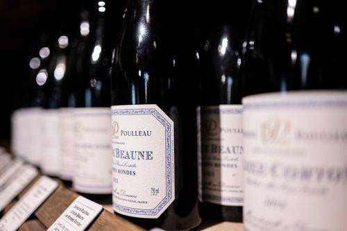
Define the brand identity
A magnum label design must also reflect how the bottle will be used. A magnum evokes gifting, group meals and special occasions. It also conveys a perceived move upmarket. A wine estate’s branding is based on four key markers:
- Personality the character of the estate and its vintages.
- Difference what sets the wine apart from its shelf neighbours.
- Our Story : the origins and expertise to pass on.
- Target Customers seeking reassurance are not looking for the codes of a young, urban audience.
To create labels based on these guidelines, Votre Étiquette offers more than 500 designs or a blank page. The online editor lets you customize text, fonts, colors, images, and logos, with an instant preview. Each vintage can therefore have its own unique label.
Choose fonts and colors
A clear hierarchy distributes information across three levels: identity (name, brand, designation), description (vintage, type, notes), followed by legal information. Front labels are simplified around the estate, the year and the wine’s name. Serif typefaces create a traditional look, sans-serif typefaces a modern style, and handwritten lettering an artisanal touch. Readability must remain immediate.
The label colour complements that of the glass. Deep tones and gold evoke ageing potential, while fresh palettes suit whites and rosés. Understated colours, black, off-white, textured paper and embossing remain premium codes.
Keep up with graphic design trends
Minimalism remains strong: white space, clean lines, and pared-back typography. Conversely, traditional codes (castle engravings, 19th-century script) continue to perform well in the domestic market. Vintage styles rely on hand-drawn illustrations, raw textures, and earthy tones to convey authenticity. More expressive styles dare to use bold contrasts, gradients, neon accents, or surreal overlays, which help improve memorability.
The artistic approach must remain true to the perceived quality of each vintage. A handcrafted illustration works well for a natural wine. However, when poorly aligned with the positioning, it reduces the perceived luxury of a wine label.